› Forums › Geocaching in Wisconsin › Geocoins › 2010 WGA Geocoin Ideas Development and Discussion
- This topic has 126 replies, 30 voices, and was last updated 15 years, 9 months ago by
-cheeto-.
-
AuthorPosts
-
03/16/2010 at 12:46 am #1924882
@HeliDood wrote:
@cheezehead wrote:
Ummmm..what’s difference if it’s shaped like a cow or the state?
A real life cow is a 3-Dimensional object that can be viewed from any angle, even underneath or behind if you’re brave enough.
Wisconsin, as we recognize it, is a 2-Dimensional shape viewed on a map.
Seeing the shape of Wisconsin reversed 180 degrees makes my head hurt.So do you have a design you’d like to share?
03/16/2010 at 12:50 am #1924883@zuma wrote:
@HeliDood wrote:
I like some of the concepts, but I don’t like the coins in the shape of Wisconsin. If our state was shaped like Colorado I’d be OK with it.
I’d prefer a round or square coin with the state superimposed on the front and/or back.With elaborate designs on both the front & back, I can see some geography challenged cachers (I believe they may exist) mistaking the front for the back and vise versa.
In my travels all around the country, you wouldn’t believe how many people I’ve met that have absolutely no idea where Wisconsin even is! Most of them say something like, “Thats like next to Canada, ain’t it?”
Interesting take on it.
I guess I would have to say that the decision was made by the board for a state shaped coin, in part because of member requests, in part because they will likely sell well, and in part because we have not done that yet.
Anyway, the decision to have it shaped like the state is a done deal at this point, and I look forward to the way that designers work within this limitation.
z
I wouldn’t call it a limitation.
03/16/2010 at 1:02 am #1924884@-cheeto- wrote:
So do you have a design you’d like to share?
In fact, I did. But not anymore. I’m an artist.
I had a few concepts I’ve been playing with.
They’ll just have to wait at least one more year.Sorry my talents can not be of any use.
03/16/2010 at 1:07 am #1924885You can design the shape to be appealing from both sides and it still look like Wisconsin.
Keep those ideas coming in everyone!!
And don’t forget to submit your finished designs to geocoin2010
wi geocaching com. 03/16/2010 at 1:59 am #1924886@HeliDood wrote:
@-cheeto- wrote:
So do you have a design you’d like to share?
In fact, I did. But not anymore. I’m an artist.
I had a few concepts I’ve been playing with.
They’ll just have to wait at least one more year.Sorry my talents can not be of any use.
Ok, I agree that you can have your opinions about the shape, but look at from this point of view. You say you are an artist. I want to commission you to design at art project but you have to stay within certain perimeters.
Will you reject the project cuz you do not like the perimeters?And after all, how much time are you going to really going to spend looking at the back of the coin
03/16/2010 at 1:45 pm #1924887A few thoughts…
1. The state shape requirement IS a limitation (def: an imposed restriction that cannot be exceeded or sidestepped), but it doesn’t have to be a bad thing. Sometimes the most fun comes from how far can you push limitations yet stay within them.
2. Don’t confuse an artist with a commercial or commissioned artist. The pure artist’s creativity is generally stifled when outside constraints are placed upon them. Some artists can’t do what they feel is their best work as commissioned or commercial artists. Perhaps this is the case for HeliDood.
3. If there is someone out there who has a great idea that they don’t feel they can submit because they think they “can’t draw” or “aren’t creative enough” to put it to paper, I’d be happy to work with you (assuming I like the idea as well and have time). I really don’t care if I get credit for creation or the rewards of winning. If it’s your idea, you can submit the design. The creation is the fun for me (though I would like one of the regular coins if it’s chosen). Email or PM me.
03/16/2010 at 2:03 pm #1924888Just a thought for anyone who might be getting stuck on the whole backwards state thing. Perhaps looking at it from a different direction could help…
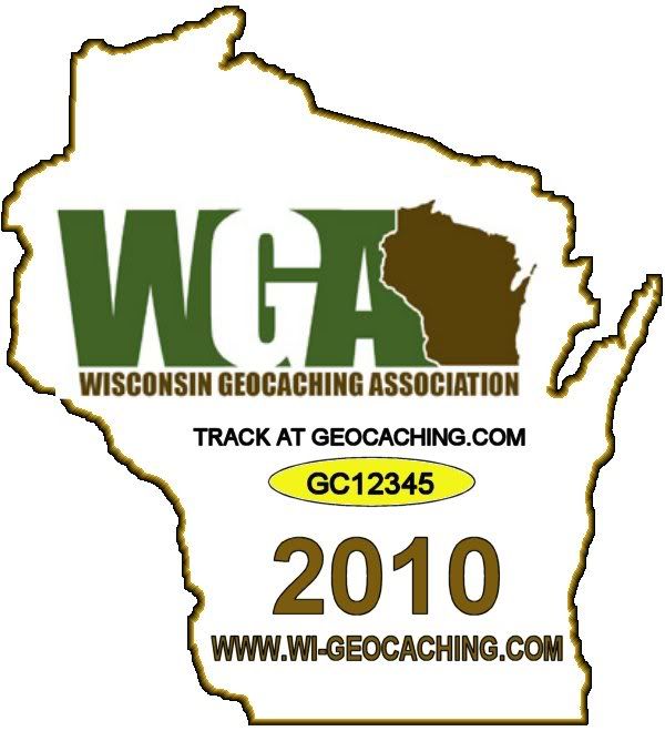
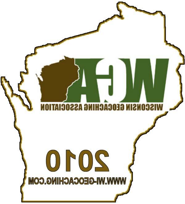
No…this is not a real submission suggestion. Only an example of orientation. (Although I could say…”I call it Caching in Winter!”)03/16/2010 at 6:19 pm #1924889Here’s an idea that someone might be able to work with–
On the reverse side of the coin put any text or graphics (i.e. the WGA logo)
REVERSED on the back of the coin (as if the coin was transparent or viewed in a mirror).Might look kinda neat. Someone can try it.
Part of the reason I’m having an issue with the “coin must me easily identifiable as the the shape of Wisconsin”, is that, when the coin is viewed from the reverse side –and when the reverse side is almost indistinguishable from the front side (to those geocraphically challenged, perhaps– The back side is not easily recognizable as the the state of Wisconsin.
Thats hard to put into words, but I hope you can at least get an idea of what I’m trying to say.
03/16/2010 at 8:16 pm #1924890I’ll draw something up in a little while that might fit your idea.
I’m having a hard time understanding your problem with geographically challenged cachers viewing the coin. If they’re that dim, they won’t recognize the state one way or the other.
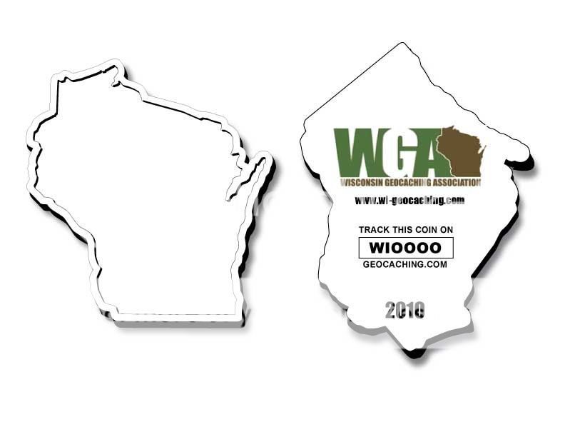
03/16/2010 at 9:19 pm #1924891Actually, we think all the designs so far are good. There hasn’t been one we didn’t like. Kudos to everyone who has submitted their ideas. 😀
03/16/2010 at 9:52 pm #1924892Orientation aside, I like the back of BakRdz suggestion. It looks like the back of a coin. It sounds to me like some of Heli’s concern is that on some designs it’s hard to tell the difference between the front and the back. On a round or square coin it’s not a big deal if you can’t tell the difference but on a shaped coin, if you can’t tell the front from the back by the shape (i.e. geographically challenged people) then you should be able to tell from the design. BakRdz suggestion does that very well (assuming there’s more than “snow” on the front 😉 ).
While I’m not concerned about accommodating the geographically challenged, I do think it’s a good idea to distinguish the back from the front. BakRdz backside (relax, I mean the coin) does that very well. It’s clean, clear, and functional. The orientation doesn’t matter so much to me (in fact I prefer “proper” orientation if you know what I mean by that).
Having said that, my favorite of the recent coins is 2007 – the gold one with the compass and state on one side and the hayward fish, cana lighthouse, etc on the back. That one is really cool! However it’s a very different design – there’s alot of texture and detail. The cow is very simple and neat and they are both good designs (except I don’t like what was chosen as “spots” on the cow – should have been more geocaching related)
Anyway… there’s 2 useless cents and about 2 minutes of your life you’ll never get back. Still thinking about this and will try to submit something.
03/16/2010 at 11:27 pm #1924893This one is based on HeliDude’s idea of a backwards back. I actually kind of like the front. Clean and simple. But I’m not to crazy about the reverse idea on the back.
If someone wants to, feel free to take this one an change it any way you like.
 03/17/2010 at 12:22 am #1924894
@BakRdz wrote:
Just a thought for anyone who might be getting stuck on the whole backwards state thing. Perhaps looking at it from a different direction could help…
No…this is not a real submission suggestion. Only an example of orientation. (Although I could say…”I call it Caching in Winter!”)Now the back looks like New Jersey LOL
03/19/2010 at 3:42 pm #1924895Bump!
03/19/2010 at 4:57 pm #1924896Please remember to email your design entries that you would like considered for the vote to geocoin2010
wi geocaching com. Again, this thread is for sharing and developing your ideas with others.
-
AuthorPosts
- You must be logged in to reply to this topic.