› Forums › Geocaching in Wisconsin › Geocoins › 2010 WGA Geocoin Ideas Development and Discussion
- This topic has 126 replies, 30 voices, and was last updated 15 years, 9 months ago by
-cheeto-.
-
AuthorPosts
-
04/02/2010 at 4:23 pm #1924957
I like your previous design with the public domain “G”. No issues with using it. I agree that the trails got a little busy with all the additions, but really liked the concept.
I also like how you incorporated the scuba diver and sky diver. The XC skier hiddin in the snow is a little over used, though.
04/02/2010 at 4:41 pm #1924958dunno how this post got here. It can be deleted
04/02/2010 at 4:50 pm #1924959@BakRdz wrote:
Did I miss anything? 😛
If your next design could include a silhouette of an overweight guy reaching behind a guard rail…it’d be perfect!
I like the latest one the best! The line on the back sounds much cleaner. I like the Compass more than the G, for this design. And I like the canoe, because though I don’t canoe… I REALLY don’t run, so it’s a step in the right direction.
04/02/2010 at 7:35 pm #1924960@BakRdz wrote:
Rendered it in Adobe Illustrator with a little help from Adobe Photoshop to create the silhouettes. (I have the fun toys and a Mac)
I have a Mac but not the fun toys. 😡 Nor do I have BakRdz’s creative abilities.
Like the second one better. It “speaks” to me more. We have a canoe, but the watercraft on the coin looks more like a kayak. Now I’m going to be afraid to go out in our canoe for fear of hitting the scuba divers!
04/02/2010 at 8:05 pm #1924961Iagree stick with the g in the middle looks better and not so cleshay(spell checker isn’t working). Like wording change on the back maybe make the foot prints go in circles? I always do 😉
And thanks for the diver shout out but some bubbles would be nice;)
got the mac and toys but no skills
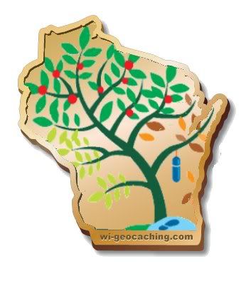
04/03/2010 at 12:11 am #1924962If plagiarism is the sincerest form of flattery, then two WGA members should feel quite complimented. This isn’t for submission, but rather because I was bored.
 04/03/2010 at 12:43 am #1924963
@BakRdz wrote:
Next version. (Thanks for the feedback!) Removed the trails on the front and changed the wording on the back. The “trails” thing just wasn’t working, especially if I added the canoe. Also got the gratuitous compass in there to avoid any potential © issues with the G thingy. Silhouettes are now also raised a bit in relief.
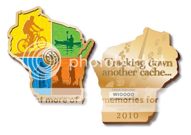
And in case you are wondering……
The scuba guy is under the canoe.
The horseback rider’s horse was scared off the trail by the biker.
The hangglider is above the hikers.
The hiker’s dog is running ahead of them after a rabbit.
The XC skier is REALLY far off in the distance behind the snowshoer, but you can’t see him because its snowing.
Same thing goes for the snowmobile.
…and the canoe didn’t leave any ripples on the back because he hasn’t gotten there yet.Did I miss anything? 😛
I like this one. Looks good.
04/04/2010 at 5:32 am #1924964You know what would be cool … take the G in the middle and make it a button that backlights the colors and plays the on-wisconsin song.
04/04/2010 at 2:54 pm #1924965Sounds like a WGA version of “Simon” there, Splash!
04/04/2010 at 3:52 pm #1924966@sandlanders wrote:
Sounds like a WGA version of “Simon” there, Splash!
Hey, back in the day I rocked on the simon! I’d be lucky to get 3 in a row now but…then whooboy! Look out.
04/05/2010 at 2:43 am #1924967@Team Black-Cat wrote:
If plagiarism is the sincerest form of flattery, then two WGA members should feel quite complimented. This isn’t for submission, but rather because I was bored.
love this idea, it was one of my favorites last year
04/05/2010 at 6:53 pm #1924968@sweetlife wrote:
@Team Black-Cat wrote:
If plagiarism is the sincerest form of flattery, then two WGA members should feel quite complimented. This isn’t for submission, but rather because I was bored.
love this idea, it was one of my favorites last year
I liked it a lot too! But I think it would look better on a different shape than the state outline. Such a nice image, crammed in the outline looks weird to me, but otherwise, it’s awesome.
04/05/2010 at 7:18 pm #1924969Reminder: 1 more week to submit design ideas for the vote!!!
All designs are due on Friday for consideration.
Email to geocoin2010
wga geocaching com 04/05/2010 at 9:35 pm #1924970@CacheARRRS wrote:
@sweetlife wrote:
@Team Black-Cat wrote:
If plagiarism is the sincerest form of flattery, then two WGA members should feel quite complimented. This isn’t for submission, but rather because I was bored.
love this idea, it was one of my favorites last year
I liked it a lot too! But I think it would look better on a different shape than the state outline. Such a nice image, crammed in the outline looks weird to me, but otherwise, it’s awesome.
Correct me if I am wrong but I think this tree “design” was supposed to be in the shape of WI. Now it is on a coin of the same shape. That works for me.
04/05/2010 at 10:19 pm #1924971The tree design was originally in the shape of the state. It was part of Seldom|Seen’s logo submission from a couple of years ago.
-
AuthorPosts
- You must be logged in to reply to this topic.