› Forums › Geocaching in Wisconsin › Announcements › Logo Revision
- This topic has 132 replies, 43 voices, and was last updated 17 years, 8 months ago by
Ry and Ny.
-
AuthorPosts
-
04/03/2008 at 1:54 am #1884579
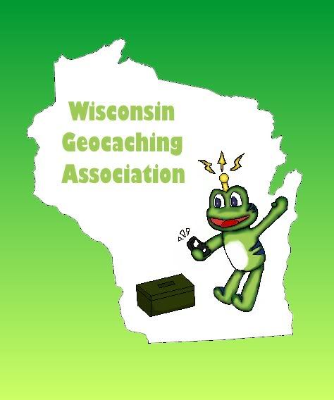
This is an logo my daughter made. I’ll see if I can talk her into doing another one without the GC trademark.
 [/url]04/03/2008 at 11:28 am #1884580
@Que232 wrote:
This is an logo my daughter made. I’ll see if I can talk her into doing another one without the GC trademark.
[/url]Wisconsin Geocachingdotcom Association?
04/05/2008 at 12:42 am #1884581@rogheff wrote:
Wisconsin Geocachingdotcom Association?
LOL. That’s kind of what I was seeing, but I had to post it…
04/05/2008 at 2:04 am #1884582@SammyClaws wrote:
While discussing this new logo at dinner a few nights ago, one of the little Sammys came up with this idea for the logo. If anyone is good at photoshop or another “editing” program, feel free to make adjustments!!

Thanks!!
SammyClawsWho’s picture would be here? May I suggest marc_54140?
04/05/2008 at 2:14 am #1884583No, we want people to !!BUY!! the shirts, and not bring them to the post office, and hang them up!!!!
Just kidding Marc!!!
04/06/2008 at 1:41 am #1884584If not marc. Then how about the Grand and Magnificent Bunny Fu Fu?
04/06/2008 at 4:44 am #1884585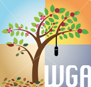
This is just a 10 minute exercise in concept only. The ides is to represent the four seasons of caching in Wisconsin. Needs to much more simplified. One bloom for spring, a falling leaf or two for fall, a snow drift for winter etc., and better still if it’s reduced to a few colors. If it doesn’t get too busy, each quadrent could hold a cache type. Bison tube, ammo can, keyholder, etc.
To really get a decent logo, you need to invest some time into concepting and choosing which concepts to explore. Out of those you explore the good ideas and go through a few more rounds to get to some final options that are ready for presentation.
The idea that you are going to solicite ideas for a logo and then just pick one is, in my perfessional opinion (I do this stuff for a living) very short-sighted. I think WGA should step up to the plate and get some professional help so we end up with an outstanding logo that respresents all of our outstanding Wisconsin caches.
Don’t take any offence, anyone, ideas are ideas, but none of these, including my concpet, are any where near the quality of the existing logo, however rudimentary it may be. It is clean, simple, direct and uncomplicated. Everything a logo should be.
IMHO, the responsibility of effectively refreshing this established logo should be left to the professionals. Even I would call in help from my piers to present 6 good options for the cacing community to vote on.
To the BOD. Please re-consider your approach to coming to a new logo design. If you are intereseted in having me persue logo options, I guarantee, 100%, that neither you nor the vast majority of Wisconsin geocachers, will be disappointed.
04/06/2008 at 6:02 am #1884586@seldom|seen wrote:
To the BOD. Please re-consider your approach to coming to a new logo design. If you are intereseted in having me persue logo options, I guarantee, 100%, that neither you nor the vast majority of Wisconsin geocachers, will be disappointed.
First, thanks for submitting a great logo design!
Second, I also think it is wise to consider designs from professional graphic artists and/or obtaining professional help in “cleaning up” the logo ideas submitted by members. One site that has been kicked around in the Board forum is 99designs.com. Through this site you can solicit logo concepts from numerous artists. The catch is you have to choose a winner and pay that artist a small fee.
What do others think? Is it fair or right for us to obtain our logo from a professional graphic artist rather than a WGA member? Should we pay someone (potentially hundreds of dollars) for a new logo?
04/06/2008 at 1:04 pm #1884587My father was a commercial artist so I spent my whole life in an on-going personal critique of the efficacy of such presentations. Personally, I will be happy with whatever is adopted since I don’t have the talent to come up with anything nearly as good as what has already been presented (to include the current logo). Some of the board members may recall the ideas that I presented a couple of years ago and will agree that the current presentations outshine those. I do have some thoughts that I feel are worth considering:
1. I believe the current deadline for submissions is a rather short fuse.
2. There is no mandate to change the current logo now or anytime in the near future. There is only a mandate to consider a change.
3. The Idea of seeking professional help is very appealing, while the thought that a member may have the talent and inspiration to provide what we are looking for is exciting.
4. When we look at the logos of successful businesses, it is noteworthy that each is immediately recognizable. Consider Chevrolet’s bad bow tie, The MB three pointed star, The logos of Microsoft, Nike, the Olympic rings are all immediately recognizable, very simple and effective. Simplicity is a key. Of course these companies have poured tons of cash into advertising and we have no intention of doing that, but simplicity still cannot be overemphasized.
5. The logo will identify our organization, our home, our sport and our members. I want to be proud to wear it on myself, my cachemobile, my cache pages. I am sure that whatever we come up with will fill that wish just as our current logo does.
Please keep those ideas coming, we will all know when the right one comes along. ~tb
04/06/2008 at 1:14 pm #1884588@Trudy & the beast wrote:
4. When we look at the logos of successful businesses, it is noteworthy that each is immediately recognizable. Consider Chevrolet’s bad bow tie, The MB three pointed star, The logos of Microsoft, Nike, the Olympic rings are all immediately recognizable, very simple and effective. Simplicity is a key. Of course these companies have poured tons of cash into advertising and we have no intention of doing that, but simplicity still cannot be overemphasized.~tb
Hmmm, sounds like a good idea for a cache…
04/06/2008 at 2:16 pm #1884589@Jeremy wrote:
@seldom|seen wrote:
To the BOD. Please re-consider your approach to coming to a new logo design. If you are intereseted in having me persue logo options, I guarantee, 100%, that neither you nor the vast majority of Wisconsin geocachers, will be disappointed.
First, thanks for submitting a great logo design!
Second, I also think it is wise to consider designs from professional graphic artists and/or obtaining professional help in “cleaning up” the logo ideas submitted by members. One site that has been kicked around in the Board forum is 99designs.com. Through this site you can solicit logo concepts from numerous artists. The catch is you have to choose a winner and pay that artist a small fee.
What do others think? Is it fair or right for us to obtain our logo from a professional graphic artist rather than a WGA member? Should we pay someone (potentially hundreds of dollars) for a new logo?
I agree SS has a great design…the best yet offered. I totally think the time line is WAY too short and there is no reason why we need to have a Member submit the design. Not sure how much we should pay to get a new logo though…
04/06/2008 at 3:41 pm #1884590The WGA is an internet community, not a multi-national conglomerate that needs to hire out professional help to design a logo.
I personally think that the WGA is full of talent, and that a logo should come from one of us, because it’s going to represent all of us. If it looks a little odd or funny, that’s fine, because so do most of us. 😀
I personally think we already have the perfect logo to represent us. Cheesehead Dave’s (motionless) logo is simple and to the point, and in my opinion is better than the one we have now.
Logo’s like the Nike Swoosh, and Chevy Bow-Tie are only recognizable by their simplicity because those companies have spent hundreds of millions of dollars to burn those images into our minds. Our logo can’t be that simple. I believe it needs to contain our full name, abbreviation and a simple image in order to be recognized. Unless we have a member with deep pockets that wants to invest in a ad campaign that is. 😀
Again, this is just my opinion. I have no clue what it would cost to hire out the logo work, and have even less of a clue if the WGA can afford it, or should afford it. If we do take that route, I’m pretty sure we’d wind up with an awesome logo, but would it really be worth it?
I’d love to know how many other geocaching communities have paid out for their logo design before we jump in and do it.
04/06/2008 at 3:44 pm #1884591…and now for some odd reason, after going back and reviewing the choices on this thread, I for some reason I want to send Dave some money, and can’t get frogs out of my head… 😯 😕
😉
Nice touch Dave!!!
04/07/2008 at 12:34 pm #1884592About my submitted logo:
I got a PM regarding this, and although I have already mentioned this in a different thread, I’ll mention it again here:
When I was reading a web page on logo design, one of the styles was the “knockout” lettering like what I did with mine. After I put it together, I realized that it looked a lot like this existing logo:
Mine for reference:

I won’t be offended if people want to shy away from mine if they think it looks too similar.
I also fully support the idea of using the 99designs site for a logo.
04/07/2008 at 12:53 pm #1884593@seldom|seen wrote:
If you mirror that tree, it would begin to look a little bit like the outline of WI, which may add a little bit more meaning to the initial design.
-
AuthorPosts
- You must be logged in to reply to this topic.