› Forums › Geocaching in Wisconsin › Announcements › Logo Revision
- This topic has 132 replies, 43 voices, and was last updated 17 years, 8 months ago by
Ry and Ny.
-
AuthorPosts
-
04/07/2008 at 2:04 pm #1884594
I agree with Seldom Seen that we need professional help. (Heck, people have been telling me that for years. ) Also like Seldom Seen, I’m also in the graphic arts business — as a creative director and editor — and I understand that logos require a process. That’s why I suggested that the time line as now set up by the board is too short. Zuma said it would be difficult to change the time line now, but I don’t understand what would be difficult about changing it. Other than the general feeling among some people that “we need to get something done” I don’t think there’s a hard and firm need for the present deadline. I know a trained graphic artist who is willing to work on this pro bono and will be able to start working on some ideas in late May.
04/07/2008 at 3:02 pm #1884595@kbraband wrote:
I agree with Seldom Seen that we need professional help. (Heck, people have been telling me that for years. ) Also like Seldom Seen, I’m also in the graphic arts business — as a creative director and editor — and I understand that logos require a process. That’s why I suggested that the time line as now set up by the board is too short. Zuma said it would be difficult to change the time line now, but I don’t understand what would be difficult about changing it. Other than the general feeling among some people that “we need to get something done” I don’t think there’s a hard and firm need for the present deadline. I know a trained graphic artist who is willing to work on this pro bono and will be able to start working on some ideas in late May.
Well then, free is a good thing! Get him started.
I think the members of the WGA should still be the final word on which logo gets the go, even though the professionally done one will most likely be the best. It’s already better than mine! 😀
04/07/2008 at 7:11 pm #1884596Well, now I’m in too deep. The mirrored tree idea is BRILLIANT and the kind of thing that would come out of a brainstorming session, which, I guess is what this forum is.
I’ve had a couple people comment on the concept I posted and most think is has some merit. Now, with the tree outline idea, I feel the need to explore that and then post a revised, simplified, seasonal, Wisconsin-shaped, WGA and Wisconsin Geocaching Association titled icon.
And I will do it for free, which is the best part. When I suggested that we hire out help, I did so recognizing the benefit of the process and not necessarily the final design. You end up seeing things (like the state shape) in the process and that flushes out more ideas.
But now, looking at the concept and the shape idea and seeing these things come together, I have a feeling that I will be able to pull something together that looks really good and incorporates all of the elements we want to convey.
Stay tuned….
04/07/2008 at 11:00 pm #1884597I like seldom|seen’s idea the best, the simple 4 seasons with the tree and WGA the only thing is do we really have 4 seasons, seams more like 2 up here in the northwoods SNOW AND NO SNOW and the SNOW season is lasting way too long
If a professional wants to work on it, give him the link to our brainstorming session here and it might give him/her somewhere to start
Barry and Valarie of sweetlife
04/08/2008 at 2:08 am #188459804/08/2008 at 6:13 am #1884599Alright, here it is flushed out a bit. Needs to be simplified some and the WGA needs to be more dominant, but this will be my “official” submission.
Hope you like it…
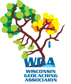 04/08/2008 at 6:16 am #1884600
just realized there should be a footprint in the little snowdrift… leave that to your imagination for now.
just FYI, the pill bottle/bison tube in hanging “over” Lake Winnebago
04/08/2008 at 11:30 am #1884601Very nice. I like the footprint idea too. The one thing I’d suggest is changing the color of “WGA”. Maybe it’s my old eyes, but it seems to get lost in the tree trunk.
04/08/2008 at 11:31 am #1884602@seldom|seen wrote:
Alright, here it is flushed out a bit. Needs to be simplified some and the WGA needs to be more dominant, but this will be my “official” submission.
Hope you like it…
I really like the first tree better, This one just looks like it’s dying. But then again, I’m a Shrubber.
04/08/2008 at 12:50 pm #1884603I think that design is too busy.
04/08/2008 at 1:22 pm #1884604Could you make the leaves into a different shape? Maybe the shape of WI… 😆
TE04/08/2008 at 1:40 pm #1884605I really like the shape idea s|s, but I prefer the simpler/more realistic leaf design to the latest one. My 2 cents…
On the Left Side of the Road...04/08/2008 at 3:15 pm #1884606Thanks for the input guys! Yes, I agree it is TOO busy as I said. I will simplify and see what I can do to still maintain the shape of the state. I value everyone’s input! I am also having a co-designer take a look at it. Stay tuned…
04/08/2008 at 10:11 pm #1884607I also liked the other tree better.
04/09/2008 at 2:36 pm #1884608As some have mentioned, here is a possible updated version of the current logo. I thought since it was mentioned that the current logo just needs a little updating that it should be considered.
-
AuthorPosts
- You must be logged in to reply to this topic.