› Forums › Geocaching in Wisconsin › General › Logo varients
- This topic has 36 replies, 17 voices, and was last updated 15 years, 1 month ago by
mongo1965.
-
AuthorPosts
-
12/13/2010 at 5:47 pm #1731224
I deal with identity and branding in my daily work and see the current use of multiple logo versions as a no-no when it comes to organization identity. I like the updated version that was created for the WGA T-shirts this year and think it could be adopted without going through any of the drawn-out discussions we had when the existing logo was adopted, by putting it up for a simple vote of the body. But, as I have been know to read the community wrong before, I thought I’d poll the idea just to see.
12/13/2010 at 6:20 pm #1940217What does the “full color” image look like? Is that the image on the background of the site?
12/13/2010 at 6:34 pm #1940218@Lostby7 wrote:
What does the “full color” image look like? Is that the image on the background of the site?
Yes, the background version that was updated by BakRdz for the Campout T-Shirts. This link shows both the 4 color and one color version, the later of which could be made into a nice 2 color version as well.
12/13/2010 at 6:37 pm #1940219T-Shirts OK, they are not quite the same. The versions I’m suggesting are those on the T-Shirts, not the background image which is slightly unbalanced.
Bakrdz did a nice job with the modifications and it seems not only a shame to not adopt these, but also a something of a disconnect between branded material being worn by some geocachers and the site’s version.
12/13/2010 at 6:42 pm #1940220@Lostby7 wrote:
What does the “full color” image look like? Is that the image on the background of the site?
I believe that is what s|s is referring to. A single color variant (well single color printed, 2nd color being the shirt color) was produced for the back of the t-shirts that were for sale at the cache ba$h and at the picnic. The background is a full color variant that (to my knowledge) had not been published publicly before.
It’s essentially the current logo with the 4-color geocoin design as the state rather than a brown state.
The 2 use-cases of the logo were not any attempt at changing the group’s logo. They were used to tie-in with the 2010 WGA Geocoin “theme”.
Interesting poll though and I am sure there are a few people interested in the results of the vote. (maybe not so much the results of re-opening a can of worms…)
12/13/2010 at 7:01 pm #1940221@-cheeto- wrote:
Interesting poll though and I am sure there are a few people interested in the results of the vote. (maybe not so much the results of re-opening a can of worms…)
PLEASE understand that I DO NOT want to open that can again 🙄 I simply see some disparity between variants of the same design, or more specifically an enhanced version of the design and one we have had a chance to vote on if bakrdz had been part of the original process.
In this case I would not consider the enhanced version as changing the essential elements and layout of the logo. Same design with a bit more punch and a whole lot more captivating. Arguably a case could be made to the contrary, that could open that can, but a carefully worded referendum vote on “varients” could mitigate that scenario.
12/13/2010 at 7:25 pm #1940222I didn’t vote because I’m not sure which option I’d pick for my opinion. Also after reading some of the comments I’m a little more perplexed.
My first comments were going to be that we should consider both a 2 color B&W and a Full Color logo. I’m not a graphics guy but have worked with many companies that provided their logo in both of these formats as well as scalable and fixed sizes for various purposes.
My “perplextion” comes from the fact the “coin” logo being used on the site isn’t really a logo? I’m not sure if I’m stating that correctly, however.
In any event I think the new full color logo is awesome and would be a great asset to the organization.
12/13/2010 at 8:58 pm #1940223I didn’t vote either, I might, but I am wondering, and it is possible I am just restating what CodeJunkie said: Isn’t the BakRdz design something that was voted on for a geocoin and/or a T-shirt? I remember skimming those forums, but not having a big interest, I didn’t vote. I believe that was something voted on for a specific project.
And I don’t believe I voted on the main WGA logo, I think that issue was something that happened before I joined.
Are you asking if want to vote to make the BakRdz design the new WGA logo? It was my understanding that design was for a specific project, and that next year’s T-shirt and/or coin, would be open for other designs. And that the logo on the website at the top is our logo for everything “permanent”–as permanent as anything is these days.
Sorry if my post seems redundant. Just trying to clarify. Thanks.
12/13/2010 at 9:03 pm #1940224Well that’s odd. The full color coin “logo” that was the background for the whole website disappeared in the last few hours.
12/13/2010 at 9:53 pm #1940225@CodeJunkie wrote:
Well that’s odd. The full color coin “logo” that was the background for the whole website disappeared in the last few hours.
Bad timing to be removed, but so there is no confusion, it was removed for an unrelated reason.
12/13/2010 at 10:01 pm #1940226For further clarity, here is what was on the background with muted colors.
 12/13/2010 at 10:59 pm #1940227
@amita17 wrote:
It was my understanding that design was for a specific project, and that next year’s T-shirt and/or coin, would be open for other designs. And that the logo on the website at the top is our logo for everything “permanent”–as permanent as anything is these days.
Your understanding of what I was trying to say is correct.
Not sure what’s so “perplexing” about it.
The board chose to use a “special edition” version of our logo on a t-shirt that had elements of the 2010 geocoin design in it to tie in with the 2010 Geocoin. Both “projects” happening at the same time and chaired by the same person (me). No conspiracy. No underlining agenda to try to change the logo to that one.
Google presents a special edition Google logo on their main page for special events. We presented a Geocoin themed logo on our 2010 t-shirt back. (typically we don’t print a front and back) Yes, folks who are wearing those t-shirts are “representing” the WGA but there are also WGA shirts out there with all sorts of other things like “proposed logo designs that never won the vote”, design contest winners for events, etc.
Not trying to sway the outcome of the poll, just trying to respond to what some think is “perplexing”.
Not every member agrees with the decision to print that “special” logo. I understand that viewpoint so please don’t think I’m judging anyone who thinks “you shouldn’t mess with the logo”.
12/14/2010 at 12:55 am #1940228I voted not to care either way
I like both versions and think there should be a link to either to put on webpages correspondence etc.
12/14/2010 at 2:17 am #1940229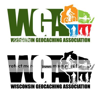
My intent for posting this image out here is only to hopefully clarify what is being discussed (if I am interpreting the poll correctly). Obviously, as the creator I would be honored if the “modification” of the logo I designed were adopted as the official logo, but I would like to remain impartial as I am probably to close to the decision.
The one opinion I do have that I will voice is regarding the use of multiple logos. My suggestion to modify the logo for the back was only to connect the image on the front and the back together creatively for this special case. As a general rule I agree it is improper to have multiple versions of a logo, but I do like Cheeto’s Google analogy as an explanation for the exception. Going forward, I would suggestion only having one primary logo (whether it is shown in full color or one color as I’ve posted). Having multiple logos for the membership to will create an non-cohesive image and cause confusion.
12/14/2010 at 2:25 am #1940230Just to be clear, the current Board of Directors is not going to be taking any action on changing the logo. It is a dead issue, and this issue will not be revisited by the current Board of Directors. We have accomplished a lot this year, which we are proud of. One of the things that has allowed us to accomplish as much as we have is to do our utmost to not be drawn into controversial topics and to avoid spinning our wheels on issues already decided.
If you want to change the logo, you will need to ask that question of those candidates up for election in January, and vote just for people who wish to change the logo.
Thank you,
zuma
-
AuthorPosts
- You must be logged in to reply to this topic.