› Forums › Geocaching in Wisconsin › General › New Logo Discussion (Open To All)
- This topic has 85 replies, 36 voices, and was last updated 17 years ago by
 Team Black-Cat.
-
AuthorPosts
-
01/07/2009 at 8:32 pm #1727505
You’re just gonna have to swallow this one guys, I can’t bite my tongue any longer, it is bleeding profusely…
@Team Deejay wrote:
I personally like the new logo. The lines are clean, the effect is dramatic, and it has a professional look to it.
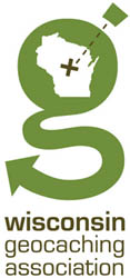
Any logo worth it’s salt should be these things. It should also stand alone and communicate what the acronym stands for. The old logo, while dated, did this quite well and simply. The new logo neither stands alone (among many others trying to communicate a similar identity and sport), nor does it say anything about “geocaching” which the old one did and the Washington version does with the flag and “x”.
@Team Honeybunnies wrote:
I think I’ve only been on the Washington site once, and I’ve looked at most everyone’s site at some point or another. Except for someone pointing it out, I’m not sure we would ever have known there was a similarity. It’s a solid, more modern logo.

Seriously? What if the similar logo belonged to Minnesota or Michigan or Illinois, would you still have no issue with it and “see” no similarity?
I suspect that many more will respond the same way, but it is clear to me, even from the first 3 responses, that this potential BOD did not favor this logo.
I will admit to not voting for this logo in any of the elections
I will have to admit that I liked the lower-case “g” logo the best
I did not vote for this particular design, but I do like it
I also suspect that the current BOD had similar sentiments. Part of the responsibility of a BOD is to make sound decisions for the general body even when they may not be popular. Here, an unpopular design, by these accounts, won out because the general body was unaware at the time this version was voted on, of the similarity of the logo to Washington’s. I believe the outcome would have been different if they had. And, even if the outcome were the same, I strongly believe the BOD should have thrown this one out, as I thought it had decided to do sometime this past summer, on the basis that it was too similar to Washington’s.
I bet if I took this and Washington’s logo to a trademark lawyer and asked if there were any potential use violations, simply based on the design, he’d say, “you bet”. I’ve been there. It IS substantially similar, cripes the “G” is identical! Your “graphic designer” could have at least taken the time to find a substantially different font.
The whole thing leaves me feeling the same way I did all year. I echoed the sentiments of many of us in the field of design and no one listened. Now we have, what is in my opinion, a weaker communicative logo than we started with, and a copycat one at that. Maybe that was the intent, to keep it under the radar and not call attention to ourselves.
BUT I am in the minority, it seems, as I have been all along. And, while I can B&M, I can’t do a thing about it anymore which makes me feel even worse since I had an opportunity to join the BOD last year and had to turn it down, just like I have to this year.
01/07/2009 at 9:05 pm #1899776@seldom|seen wrote:
You’re just gonna have to swallow this one guys, I can’t bite my tongue any longer, it is bleeding profusely…
@Team Deejay wrote:
I personally like the new logo. The lines are clean, the effect is dramatic, and it has a professional look to it.
Any logo worth it’s salt should be these things. It should also stand alone and communicate what the acronym stands for. The old logo, while dated, did this quite well and simply. The new logo neither stands alone (among many others trying to communicate a similar identity and sport), nor does it say anything about “geocaching” which the old one did and the Washington version does with the flag and “x”.
@Team Honeybunnies wrote:
I think I’ve only been on the Washington site once, and I’ve looked at most everyone’s site at some point or another. Except for someone pointing it out, I’m not sure we would ever have known there was a similarity. It’s a solid, more modern logo.

Seriously? What if the similar logo belonged to Minnesota or Michigan or Illinois, would you still have no issue with it and “see” no similarity?
I suspect that many more will respond the same way, but it is clear to me, even from the first 3 responses, that this potential BOD did not favor this logo.
I will admit to not voting for this logo in any of the elections
I will have to admit that I liked the lower-case “g” logo the best
I did not vote for this particular design, but I do like it
I also suspect that the current BOD had similar sentiments. Part of the responsibility of a BOD is to make sound decisions for the general body even when they may not be popular. Here, an unpopular design, by these accounts, won out because the general body was unaware at the time this version was voted on, of the similarity of the logo to Washington’s. I believe the outcome would have been different if they had. And, even if the outcome were the same, I strongly believe the BOD should have thrown this one out, as I thought it had decided to do sometime this past summer, on the basis that it was too similar to Washington’s.
I bet if I took this and Washington’s logo to a trademark lawyer and asked if there were any potential use violations, simply based on the design, he’d say, “you bet”. I’ve been there. It IS substantially similar, cripes the “G” is identical! Your “graphic designer” could have at least taken the time to find a substantially different font.
The whole thing leaves me feeling the same way I did all year. I echoed the sentiments of many of us in the field of design and no one listened. Now we have, what is in my opinion, a weaker communicative logo than we started with, and a copycat one at that. Maybe that was the intent, to keep it under the radar and not call attention to ourselves.
BUT I am in the minority, it seems, as I have been all along. And, while I can B&M, I can’t do a thing about it anymore which makes me feel even worse since I had an opportunity to join the BOD last year and had to turn it down, just like I have to this year.
Ditto. It aint camo, it’s what some would call crappy Brown. In my opinion,it’s a copy-cat design. And just how much was spent on this project?
01/07/2009 at 10:16 pm #1899777In response to seldom’s and Cheezehead’s posts, I’m just going to have to respectfully disagree. Not on the matter of the merits of the logo, but purely by virtue of the fact that the logos were put to a vote of the membership. I voted, my favorite lost. I don’t think any of us want a board that makes decisions that are “in our best interests” and simply does what it wants. It’s the reason it was put to a vote. Arguing that our members were uninformed isn’t correct, because the “Washington issue” was discussed at that time. We all had ample time to peruse the information and make our decisions before voting.
01/07/2009 at 10:32 pm #1899778@Team Honeybunnies wrote:
Arguing that our members were uninformed isn’t correct, because the “Washington issue” was discussed at that time. We all had ample time to peruse the information and make our decisions before voting.
If my recollection and quick research of the timeline is right, most of the “copycat” concerns didn’t really arise until July-ish, well after the voting modules had been in place. Yes it’s incumbent on everyone to stay informed but I don’t believe the facts were well known. I could be wrong.
I wonder what the WSGA would have to say about the new WGA logo? Anyone show this to them?
On the Left Side of the Road...01/07/2009 at 10:54 pm #1899779Yikes!
I wasn’t intending to open another debate amongst the masses…
…but I guess it’s that kind of topic (one that I think many WGA members want to hear input from the candidates on). Hence why I added the thread.
Carry on…
01/07/2009 at 11:06 pm #1899780I too would like to know how much was spent on the design, I could have done it in the simple paint program that comes with windows, I too have over 10 years in the Graphic Arts Industry, and it is a shame that this logo was not dropped, I am the one that brought up the fact that the WSGA logo was similar, And I agree with gotta run the fact was brought up in the middle of the voting time. It would have been nice to be notified that the BOD was following thru with the logo (guess I missed this in the minutes of the meetings BTW are these posted anywhere?????) I see this as a big waste of $$$$. Now all the BOD is tucking their tails between their legs and saying that they didn’t choose it:
Quote:
I will admit to not voting for this logo in any of the electionsQuote:
I will have to admit that I liked the lower-case “g” logo the bestQuote:
I did not vote for this particular design, but I do like itAnd they are using the scapegoat of “its what the membership wanted”
Before anything went further, there should have been a re-vote
Have more to say on this topic, but that is what is on the tip of my tongue at this time
Barry of sweetlife
01/07/2009 at 11:27 pm #1899781This topic was “split” out of the one in the Candidates Corner. If you are not a candidate for the Board in 2009, please post your comments/opinions/questions here. Thanks!
01/07/2009 at 11:30 pm #1899782(Moved by Cheezehead )
Here are the complete results for both referendums held regarding a new WGA logo. (Remember that a first round referendum was held to narrow the field of potential new logos to 3 choices.)
Referendum 08-6: New WGA Logo Voting, Round 2

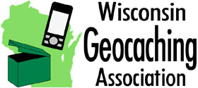
59 votes (35%) – Cheesehead Dave (WGA/state in block letters)
51 votes (30%) – Jacey7487 (stylized g)
41 votes (24%) – PCFrog (update of current logo)
17 votes (10%) – Existing WGA logo (keep current logo)Hmmmm… 3 choices but yet there was 4 to chose from. 34% voted for 2 styles there are almost the same. There should have been a 3rd round to vote on the final 3 or the final 2.
01/07/2009 at 11:30 pm #1899783@sweetlife wrote:
Now all the BOD is tucking their tails between their legs and saying that they didn’t choose it:
Quote:
I will admit to not voting for this logo in any of the electionsQuote:
I will have to admit that I liked the lower-case “g” logo the bestQuote:
I did not vote for this particular design, but I do like itBarry of sweetlife
Barry
You are attributing these quotes to members of the BOD, the parties who made these quotes or candidites for the BOD and are not currently on he BOD.01/07/2009 at 11:32 pm #1899784whoops, got my quotes wrong sorry to all that i have harmed
01/07/2009 at 11:34 pm #1899785thank jeremy for the split.
Wow, I haven’t seen it this heated in here for a while.01/07/2009 at 11:39 pm #1899786I’ll agree that there was sufficient time to dig through the logo threads and discussions about the logos submitted to find the similarity issue raised about 4 pages into the thread. And I’ll agree that many of us were aware of the similarity issue as we followed the discussion.
I don’t agree that “We all had ample time to peruse the information” because the other group who weren’t following the discussion closely, were simply not aware nor presented with, on the referendum page, the information that one logo had a similarity issue with another state.
(128 in round 1, 168 in round 2) I do not think that all 128 or 168 voters, depending on when you voted, were aware of the issue when they voted and I’d venture to guess that as much as 50% of the voting public was not. That’s a significant number and certainly would have made a difference in the tally.
Why do we have a board if we do not expect them to, at the very least, present information to the body about a possible trademark violation on the same page they are asking the public to vote on it? If they have no power to step in when necessary, then why did we let them move forward with a designer and choose a final option that none of us saw. I’ll tell you why. They didn’t want to start this firestorm.
I have nothing against the current BOD, I just think (as they all do) that the whole thing was managed poorly and in their own words, all agree that this is not the outcome they were looking for.
Defending the logo as a clean, bold design is beside the point. We could have had dozens of professional clean, bold designs to choose from for under $100.
01/08/2009 at 12:11 am #1899787@-cheeto- wrote:
Yikes!
I wasn’t intending to open another debate amongst the masses…
…but I guess it’s that kind of topic (one that I think many WGA members want to hear input from the candidates on). Hence why I added the thread.
Carry on…
No problem -cheeto-, if I want to wear the badge I might have to expect some gunplay. Maybe you could toss a softball for the next question though, like “What color are hugs?” :wink:.
01/08/2009 at 12:25 am #1899788All good points Seldom|Seen.
I can’t remember if the similarity to the Washington State logo was known at the time of the membership’s vote. I feel that if the members knew of the similarity of the logos, this one would not have been selected by the membership. It was a major hangup with the Board, and the reason it took so long for the Board to decide.
If the board was going to keep with the will of the people, the logo had to resemble the winning submission. I think the board struggled with the designer’s retouch, because the options were either color variants, or completely different then the winning logo.
I personally felt the winning logo should be scrapped because of similarities to the Washington State logo. In my opinion, the majority of the board wanted to put this chapter behind them, and make a decision. By scrapping the logo, we would open up a whole new can of worms, and/or start at square one.
This logo design contest was drawn out much longer then I anticipated. The months of anguishing over a decision was mostly because this logo was so similiar to Washington State. In fact, when we contacted Washington State to get their thoughts on the logo, they frowned on our new choice.
This just wasn’t the whiz-bang logo I was hoping we’d end up with. It fails my “wow factor” test.
There are/were other options out there. There are websites such as http://www.99designs.com which allow designers to create logos and compete against each other. You pay the winner around $200. I believe there are similar websites out there. I think this would have been money well spent. We could have been provided dozens of new, fresh logos, but various artists. The problem was, this contest would have had to run in parallel to the WGA contest.
I think we spent around $100.00 having an artist try to rework the logo, and giving use about 20 variants. I may be wrong on the dollar amount, so don’t hold me to it. When working with the artist, it’s important for them to receive feedback and direction on their designs. I’m not very artistic, so I couldn’t offer much help.
I’m really curious how the membership feels about the similarity to the Washington State logo. It would have opened a new can of worms, but perhaps we should have let the membership know about this issue.
Sorry…
01/08/2009 at 12:32 am #1899789@seldom|seen wrote:
I’ll agree that there was sufficient time to dig through the logo threads and discussions about the logos submitted to find the similarity issue raised about 4 pages into the thread. And I’ll agree that many of us were aware of the similarity issue as we followed the discussion.
I don’t agree that “We all had ample time to peruse the information” because the other group who weren’t following the discussion closely, were simply not aware nor presented with, on the referendum page, the information that one logo had a similarity issue with another state.
(128 in round 1, 168 in round 2) I do not think that all 128 or 168 voters, depending on when you voted, were aware of the issue when they voted and I’d venture to guess that as much as 50% of the voting public was not. That’s a significant number and certainly would have made a difference in the tally.
I think we would run into that in just about any election, including that of our nation’s president. Some people will be huge issues folks, some will try to stay abreast of the situation, some will skim and make their choice and some will come to the booth with no knowledge other than that they don’t like candidate B because they’re (choose your knee-jerk failing).
But, they all voted. We have the logo that was voted for. If we want to change it now, we’re going to have a hard time convincing the majority who thought it was just fine and voted as such, well-reasoned or not.
I’m not sure how the process to choose a new logo began, but if you can convince enough people, perhaps they’ll re-open it. Believe me, I respect your opinion, copyright issues and all, and I have already stated it wasn’t my logo of choice (so much for the anonymous ballot), but we have what was voted for. If the process can be continued so be it, but if not, I can live with what we have, and I’ll bet most of the others whose choice didn’t win would say the same.
The current board will have to answer some of your other questions.
-
AuthorPosts
- You must be logged in to reply to this topic.