Forum Replies Created
-
AuthorPosts
-
You might check with you local county forestery office or DNR office as they have satellite photos . I know some countys have images on their websites land parcels. I’m drawing a blank as to what office that would be…..Land Records? 😕 911 corrdinater?
GrouseTales wrote:Maybe phase 3 should have been to tweak the winning logo concept, into something unique and more desirable to the members.Our graphic artist that cleaned up the logo probably wasn’t a Geocacher. Look at how fast we got some tweaks to the logo concept from the members. That’s the type of input I wished we could have had from the artist.
quote]
This is something I was going to ask, if the artist knew what geocaching even was?Who’s idea was it to even have a graphic artist touch up the orginal winning logo,cuz now it not the original winner.
Why wasn’t the other samples show to the members?
Is it in the bylaws that the BOD has final say over a logo?
Who chose thr grapic artist?
Why weren’t members who deal in graphic design ask to help?
Maybe a poll should be made if ALL the members like the new logo.
OK, this I hope is that last I have to say on the subject.
Google WGA……..Writers Guild of America,Windows Genuine Advantage,
Western Growers Association,Western Govoners’ Association………
I’m done!@zuma wrote:
@Team Deejay wrote:
Just a procedural question. Should one of the designs receive a clear majority, will we still need to hold the second referendum?
Yes. Because we wanted to include the option of retaining the existing logo, and that will be included in the second round of voting.
zuma
Why was this not included in the first round?
Why wasn’t the old current logo not an option or choice in the first round of voting?
@K0rpl wrote:
We will now go forward with the logo that was selected by the masses.
But the new “Brown LOGO” is not what was chosen by the masses.
But IT”S NOT the logo that was voted for and similarity issue was not brought forth and the whole of WGA members did not cast a vote. This issue is not going to go away. And the presidential election is a lot bigger than this stupid vote.
AND why wasn’t the old current logo not an option or choice in the first round of voting?
Hayward Cheezehead’s Snowshoe Challange Cache Series.
Out scouting for cache placements today.
@beadelake crew wrote:
We have friends! We just can’t remember who they are.
Or none that want to be seen in public with you-Scott. Bonnie is fine, you on the other hand……….. 😯 🙄 😉 😆 😆 😆 😆
So have a clue on your X project yet, Buddy?(Moved by Cheezehead )
Here are the complete results for both referendums held regarding a new WGA logo. (Remember that a first round referendum was held to narrow the field of potential new logos to 3 choices.)
Referendum 08-6: New WGA Logo Voting, Round 2
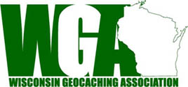
59 votes (35%) – Cheesehead Dave (WGA/state in block letters)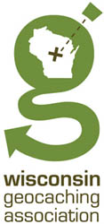
51 votes (30%) – Jacey7487 (stylized g)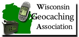
41 votes (24%) – PCFrog (update of current logo)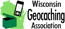
17 votes (10%) – Existing WGA logo (keep current logo)Hmmmm… 3 choices but yet there was 4 to chose from. 34% voted for 2 styles there are almost the same. There should have been a 3rd round to vote on the final 3 or the final 2.
Reposting
@seldom|seen wrote:
You’re just gonna have to swallow this one guys, I can’t bite my tongue any longer, it is bleeding profusely…
@Team Deejay wrote:
I personally like the new logo. The lines are clean, the effect is dramatic, and it has a professional look to it.
Any logo worth it’s salt should be these things. It should also stand alone and communicate what the acronym stands for. The old logo, while dated, did this quite well and simply. The new logo neither stands alone (among many others trying to communicate a similar identity and sport), nor does it say anything about “geocaching” which the old one did and the Washington version does with the flag and “x”.
@Team Honeybunnies wrote:
I think I’ve only been on the Washington site once, and I’ve looked at most everyone’s site at some point or another. Except for someone pointing it out, I’m not sure we would ever have known there was a similarity. It’s a solid, more modern logo.

Seriously? What if the similar logo belonged to Minnesota or Michigan or Illinois, would you still have no issue with it and “see” no similarity?
I suspect that many more will respond the same way, but it is clear to me, even from the first 3 responses, that this potential BOD did not favor this logo.
I will admit to not voting for this logo in any of the elections
I will have to admit that I liked the lower-case “g” logo the best
I did not vote for this particular design, but I do like it
I also suspect that the current BOD had similar sentiments. Part of the responsibility of a BOD is to make sound decisions for the general body even when they may not be popular. Here, an unpopular design, by these accounts, won out because the general body was unaware at the time this version was voted on, of the similarity of the logo to Washington’s. I believe the outcome would have been different if they had. And, even if the outcome were the same, I strongly believe the BOD should have thrown this one out, as I thought it had decided to do sometime this past summer, on the basis that it was too similar to Washington’s.
I bet if I took this and Washington’s logo to a trademark lawyer and asked if there were any potential use violations, simply based on the design, he’d say, “you bet”. I’ve been there. It IS substantially similar, cripes the “G” is identical! Your “graphic designer” could have at least taken the time to find a substantially different font.
The whole thing leaves me feeling the same way I did all year. I echoed the sentiments of many of us in the field of design and no one listened. Now we have, what is in my opinion, a weaker communicative logo than we started with, and a copycat one at that. Maybe that was the intent, to keep it under the radar and not call attention to ourselves.
BUT I am in the minority, it seems, as I have been all along. And, while I can B&M, I can’t do a thing about it anymore which makes me feel even worse since I had an opportunity to join the BOD last year and had to turn it down, just like I have to this year.
Ditto. It aint camo, it’s what some would call crappy Brown. In my opinion,it’s a copy-cat design. And just how much was spent on this project?
Same here! Maybe there could be a sub-topic called the cookin’ cache or something like for a recipe exchange. Just a thought out loas is all.
-
AuthorPosts