Forum Replies Created
-
AuthorPosts
-
@gotta run wrote:
Ours is called This %*$&#&% Thing!!!!!
What are the odds? I most ofter refer to mine as You Piece of %*$&#&%!!!!!, you’re hungry for new AA’s again? Jesus…
all you need are 4-5 larger white dots between the state and the edge of the G. The exising dots will be invisible at the scaled logo size. A few dots or signal arcs in the aforementioned area would communicate the idea.
The center X could easily become an open green ammo can shape and still work. This logo is EASILY modifed to one-color reproduction.
1 color artwork is easy to use in any application. The benfit of 1-color is that it can be turned to black without loosing anything. By the same token, you can change the color to anything you want and it still works. For example, what if you want a green T-shirt? The logo gets reproduced in white with green show-through. EASY.
Mine logo would be locked in to 4-color reproduction. It would translate well to Grayscale but you could not do 2-3 color screen printing on T-Shirts.
@Jacey7487 wrote:
This logo submission doubled as an assignment for my Typography course at the Minneapolis College of Art & Design.
You learned a lot in your class! Very clever design and a VERY strong contender for a viable concept. Very clean, communicative, affective.
Leaves many options open for tweaking as well, the “g” shape could be more subtle as it could be the shape of the state with just the decender following along the path of the “g”. That and I love the satellite being worked in as well.
What I like about this option is that it can be reduced to a singe color or 2 colors. You could knock out the transmission line as “white holes” instead of the black dots and do the same for the “x”. The X could be an ammo can as well.
EXCELLENT WORK!!!!!!!!!!! A+
BTW – I do agree with the Bison tube comments, I’d hate to send the wrong message, although I don’t know what that message would be. The final design would have to have sharpened / squared off corners like a Pill Bottle instead of the soft corners of the Bison Tube.
OK, I swear I’m done now. Some minor tweaks for final consideration.
We’d have to talk colors down the road.
Last time for this one. Thanks for the input all. It looks more and more like an Orange Tree every day… 🙄
I have taken this concept a bit further. But in my review at what would be “normal size” it will still need another step of simlification, going from 8-9 branches and a few branchlets down to 4-5.
Would need to do something still to get the footprint more visable – make white probably and scale up some more.
Anyway, wanted to get this last one in before time ran out. So here you go.
—this is still a long way away from a final usable logo—-
I feel your pain. We all get those little windows of opportunity and for some reason mine always happen when the weather is the worst that it can possibly be.
Went out in that misery last night to tag a few lonliess and get on the board this month. Man, it was my definition of NOT A GOOD TIME. But you know how it is, you go when you gotta go. I found myself in a marsh that I could only get to by crossing a hip deep creek full of spring thaw and rains.
I managed to cross that barrier only to find myself in a swamp with TONS of standing water and after the 3rd of forth 4th slip of the footing into that cold water, I just gave up and started trudging through it.
Unfortunately, the cache I was after, A Sliver in Time, was a real bugger and after 45 minutes of trudging around in the marsh in that cold driving rain, I was drenched to the core and hypothermia was setting in. That’s when the questions like “What the hell am I doing out her right now?” start setting in.
I tell you, I was never so happy to put my hand on an ammo box than I was last night! Here’s to caching and the things it drives some of us to do.
@Mathman wrote:
I think we should should show green grass with snow in the air! It needs to be realistic. Perhaps half of the ground could be snow covered and the other half sunny with thorn bushes.
Yup, already there mathman, added a green knoll on the left to balance the snow mound on the right.
But the revision is not quite ready to be posted yet…
@PCFrog wrote:
The size shown in the forums is only for purpose of having it displayed on the forums.
Right, and that was the point I was making, not for your sake as I now comprehend your depth of knowledge, but for the sake of everyone following this topic. That if you intend on using “raster” graphics like the ammo can and the GPS AND especially the “drop shadows” in your logo, you will need to have multiple versions of the file or have some individual responsible for creating and supplying files of various sizes.
As stated, this is just not the best way to go. When you post a raster graphic to the site as a concept, we take it literally, just as the concepts I posted are taken quite literally. We all need to keep in mind that what we are after here is a strong “concept” and sometimes it’s difficult to imagine what a final logo, especially one translated into vector line art, will look like when these rough concept images are staring us in the face.
However, I do agree the final design that is chosen should be made into a vector format but don’t see how that has a bearing on the sample shown in its current size, or did I miss your point?
Just for clarification I’ve been in the graphic arts field for over 17 years know the uses of vector and raster graphics. One must take into account the ability of the medium in which it is being used.
Points made above. It is clear now that your “updated” version would look more like the existing logo than does your photo-realistic concept.
@Cheesehead Dave wrote:
I also don’t think our “new” logo should resemble other states.
Yes, we do NOT need to emmulate another state’s logo. Moreover, the similarity between the 2 is so close you’d have a hard time arguing that you didn’t copy the design and could get into copyright issues if someone pressed the issue.
I will post a logo soon that is somewhere between the first concept submitted and the second that I created from scratch. I am going to go back to some simple foliage that looks like leaves, simplify the tree and do a number of other tweaks. I will also post a version that one of my cohorts is working on.
@tyedyeskyguy wrote:
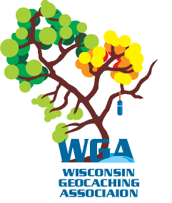
@seldom|seen wrote:

It answers all the questions it needs to:
State shape = who, where,
Ammo Can = what, why,
Tree = how.IMHO it’s missing something important. Like, who/what is it for? Seeing that logo for the first time just now, I’d have no clue it was an ammo can at the bottom, nor would I know who the logo represents. I actually still don’t know. Other than they are from “up north”.
It’s a good logo, but it would be a great one it it said “Minnesota caching club” or whatever.
For all we know, it could be the “We Live in a Box Under a Tree in Minnesota Club”. 😉
Go to the Minnesota Geocaching Website and you will see the logo “bug” (the graphic element) placed in several spots on the site. In each instance, the bug has the text “Minnesota Geocaching Association” next to it or below it.
However, there are time that a logo bug needs to stand alone and why I would attempt to get the acronym in the bug itself – it leaves less in question. Really strong loog’s don’t need that, but we’re not talking about an international or national logo here. Now, obviously, if this stood alone, you wouldn’t know what it is for if you saw it for the first time and you might identify it as the “We Live in a Box Under a Tree in Minnesota Club”.
But if you had seen it anywhere before with even a little bit of frequency, you would instantly recognize the logo if you say, saw it blown up 500% and placed alone on a t-shirt as a stand-alone graphic.
There is power in simple graphics.
Feedback is appriciated in any form and designers have tough skins we can handle anything including, “I think it sucks” (or words to that effect).
A couple of constructive things to consider:
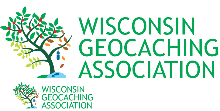
One: scalibility. If you have a raster graphic as a logo and that is anything that cannnot be reduced to lines (like the suggested update) you have to multiple versions of various sizes to use in the various places it will show up or it starts to look fuzzy when scaled up by more than 15% Here’s the great looking logo at 200%. This is a 4 inch logo. What happens if you want to print it on a t-shirt at 4 or 6 inches. You have to have someone re-create the graphic for that specific use. Not the case with vector art.
You also have to have something that looks good at the present logo size. Here’s a side by side. By my take, I can recognize and process the current line representations of the ammo can and GPS more readily than I can the photo-realitic versions. I have a hard time discerning the breaks between the graphics and the drop shadows and my mind stuggles with it. Not so with the current logo, which I look at and move on.

Vector art like the existing log (line art) can be infinately scaled and applied without loss of quality. The rule of thumb for designers it that if you can create something in vector format, do it and use raster art only when you can’t talk the client out of it.
Disemination: Once we have a finalized logo, someone will be responsible for applying it to all forms or WGA communication in various formats. The fewer the number of files there are the better. Move varients will lead to more cases of the wrong file being used.
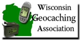
And, just for comparison, our neighbors have a very strong logo, IMHO:
It answers all the questions it needs to:
State shape = who, where,
Ammo Can = what, why,
Tree = how.The only question remaining is when? (that’s the intent of the seasonal representation).
I bring all these things up as a matter of consideration when you are thinking about a logo. It is not as simple as putting something nice looking on a page. There are a whole host of considerations to keep in mind and that is why some logo’s that look like orange trees may actually be stronger than pictures of the real thing.
I would update the current logo by adding some dimension to the existing ammo can and GPS with shade shapes like the pill bottle has in the tree.
Thanks for the input guys! Yes, I agree it is TOO busy as I said. I will simplify and see what I can do to still maintain the shape of the state. I value everyone’s input! I am also having a co-designer take a look at it. Stay tuned…
just realized there should be a footprint in the little snowdrift… leave that to your imagination for now.
just FYI, the pill bottle/bison tube in hanging “over” Lake Winnebago
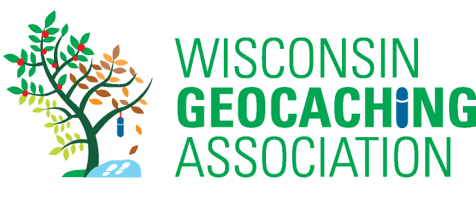
Alright, here it is flushed out a bit. Needs to be simplified some and the WGA needs to be more dominant, but this will be my “official” submission.
Hope you like it…
Well, now I’m in too deep. The mirrored tree idea is BRILLIANT and the kind of thing that would come out of a brainstorming session, which, I guess is what this forum is.
I’ve had a couple people comment on the concept I posted and most think is has some merit. Now, with the tree outline idea, I feel the need to explore that and then post a revised, simplified, seasonal, Wisconsin-shaped, WGA and Wisconsin Geocaching Association titled icon.
And I will do it for free, which is the best part. When I suggested that we hire out help, I did so recognizing the benefit of the process and not necessarily the final design. You end up seeing things (like the state shape) in the process and that flushes out more ideas.
But now, looking at the concept and the shape idea and seeing these things come together, I have a feeling that I will be able to pull something together that looks really good and incorporates all of the elements we want to convey.
Stay tuned….
-
AuthorPosts